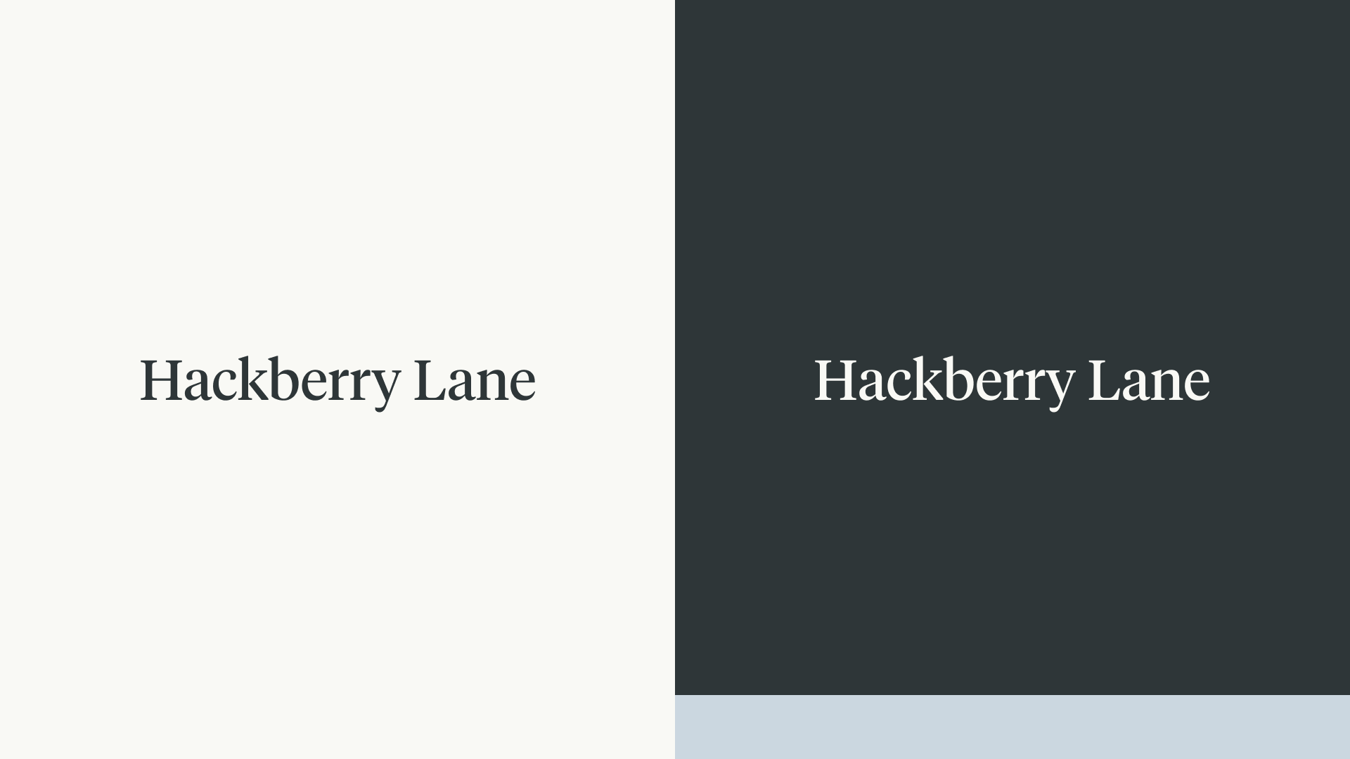
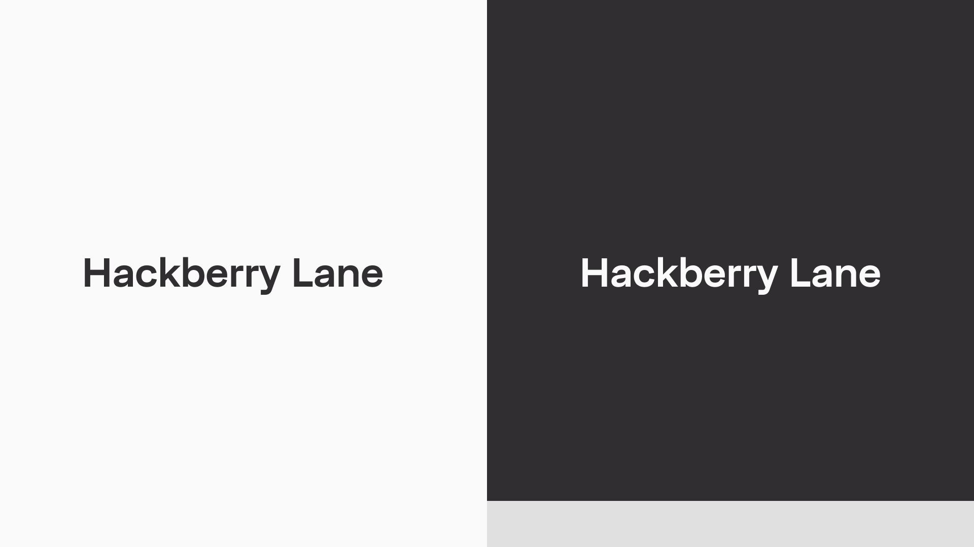
Hackberry Lane
How do you design a brand system professional enough to appeal to parents & investors, but cool enough to attract college students?
The Problem
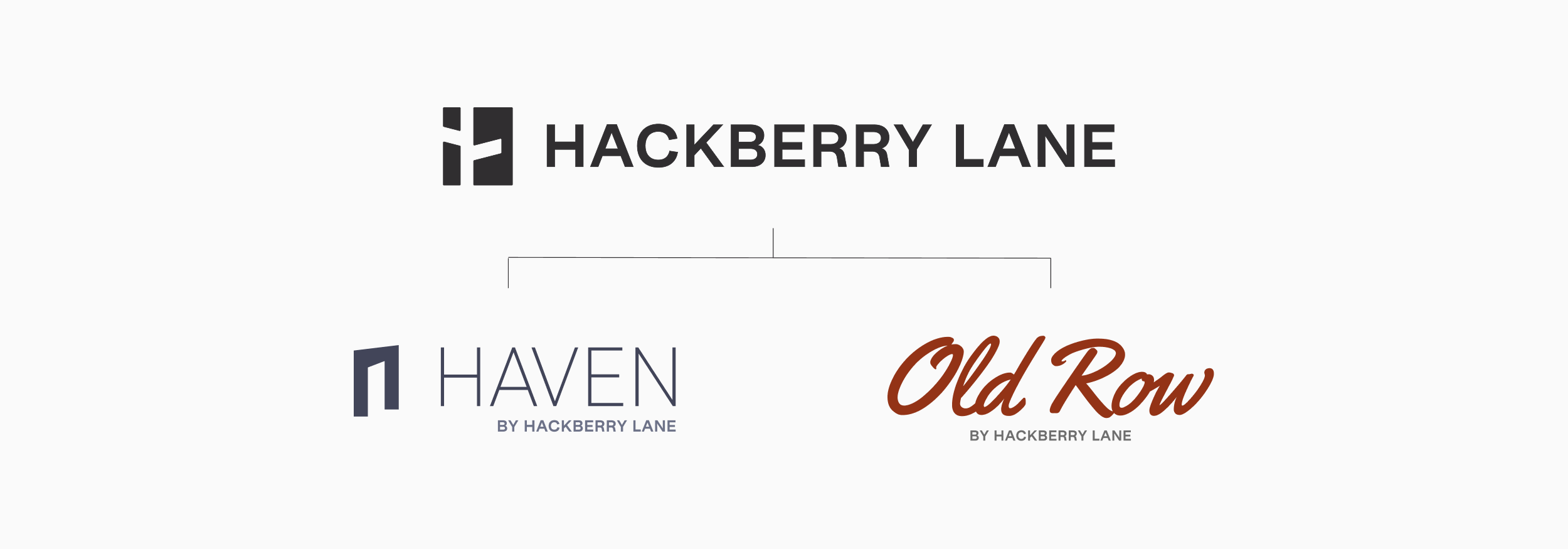
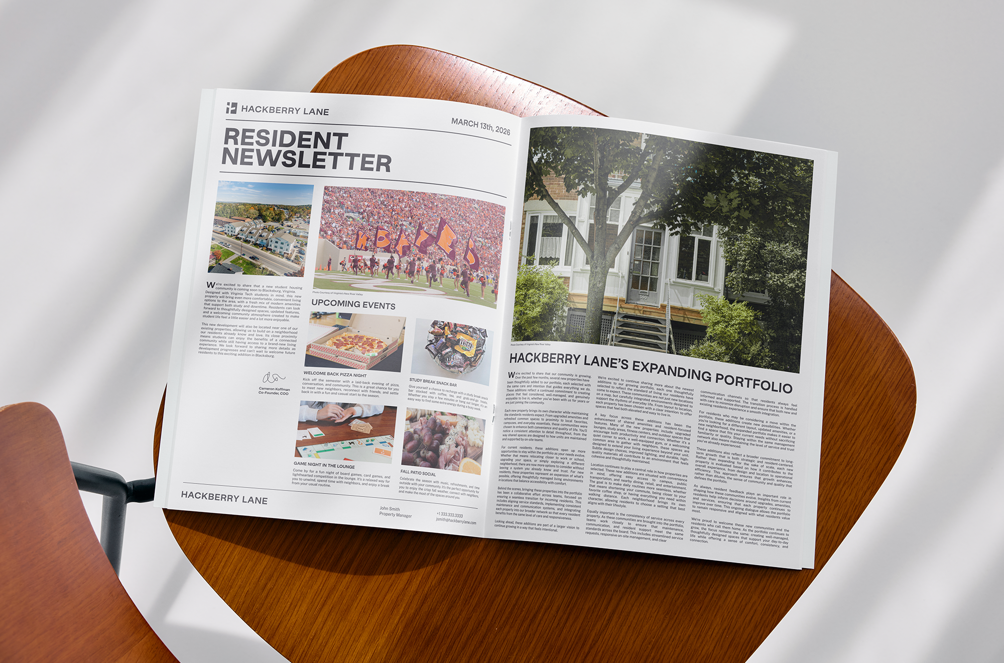
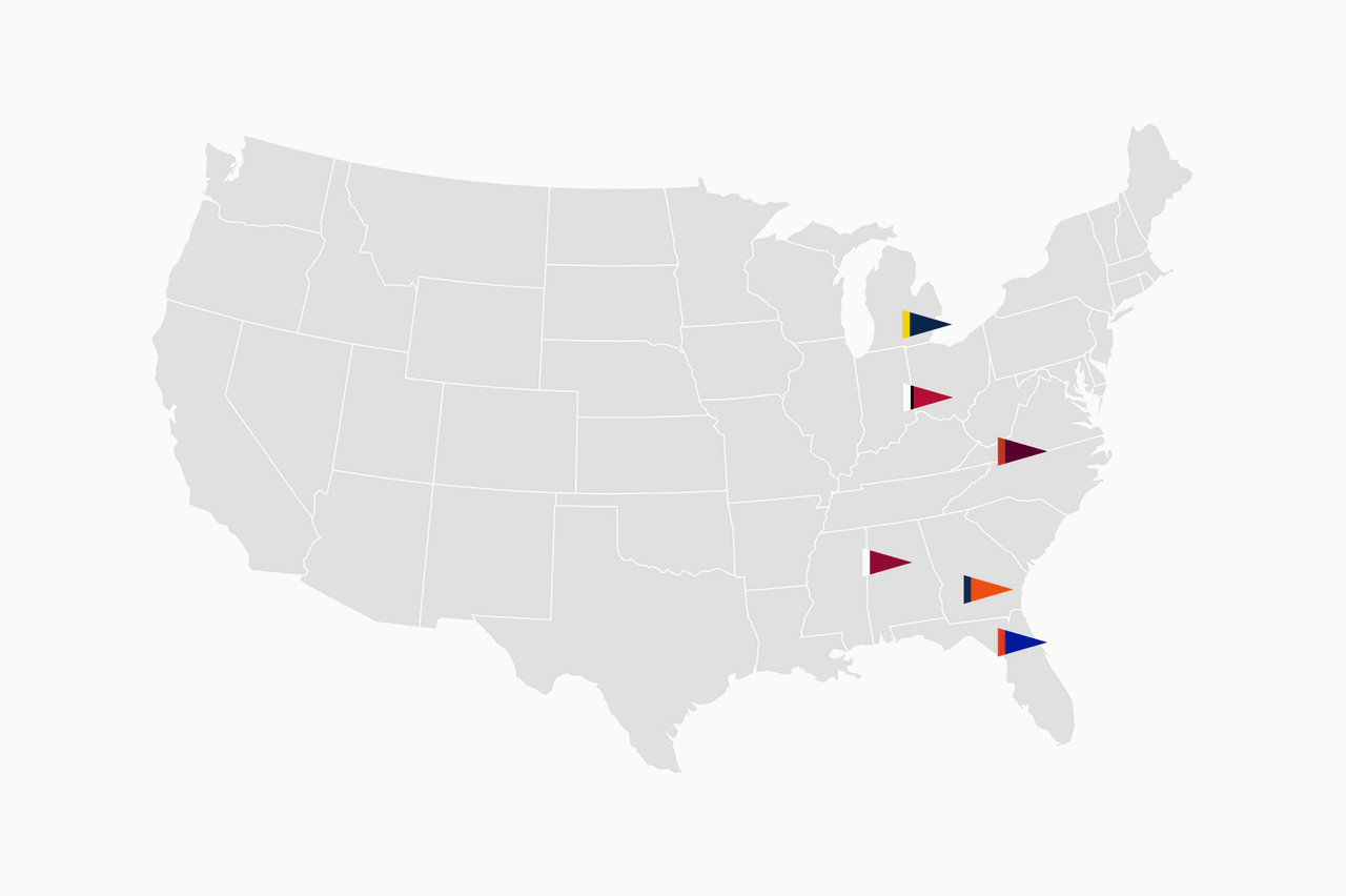
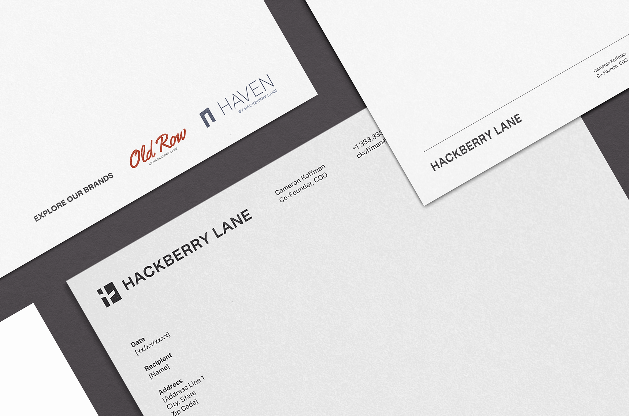
Hackberry Lane, a student housing platform with properties across top-tier universities, needed a scalable brand identity that balanced professionalism, trust, and a sense of approachability. Alongside the parent brand, Hackberry Lane required visual identities for subbrands Haven and Old Row. How do you design a brand system that resonates across investors, parents, and students?
The Insight
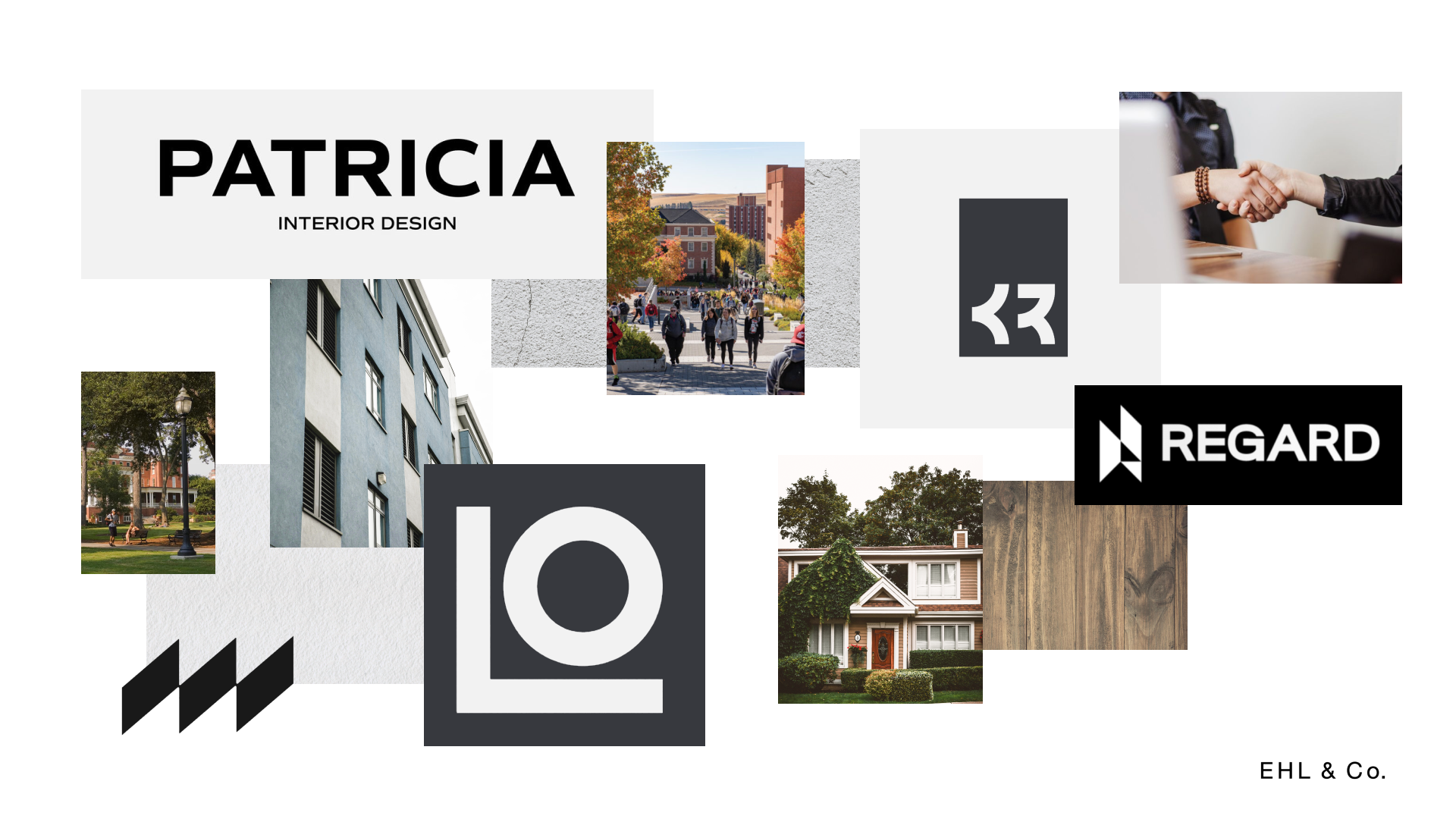
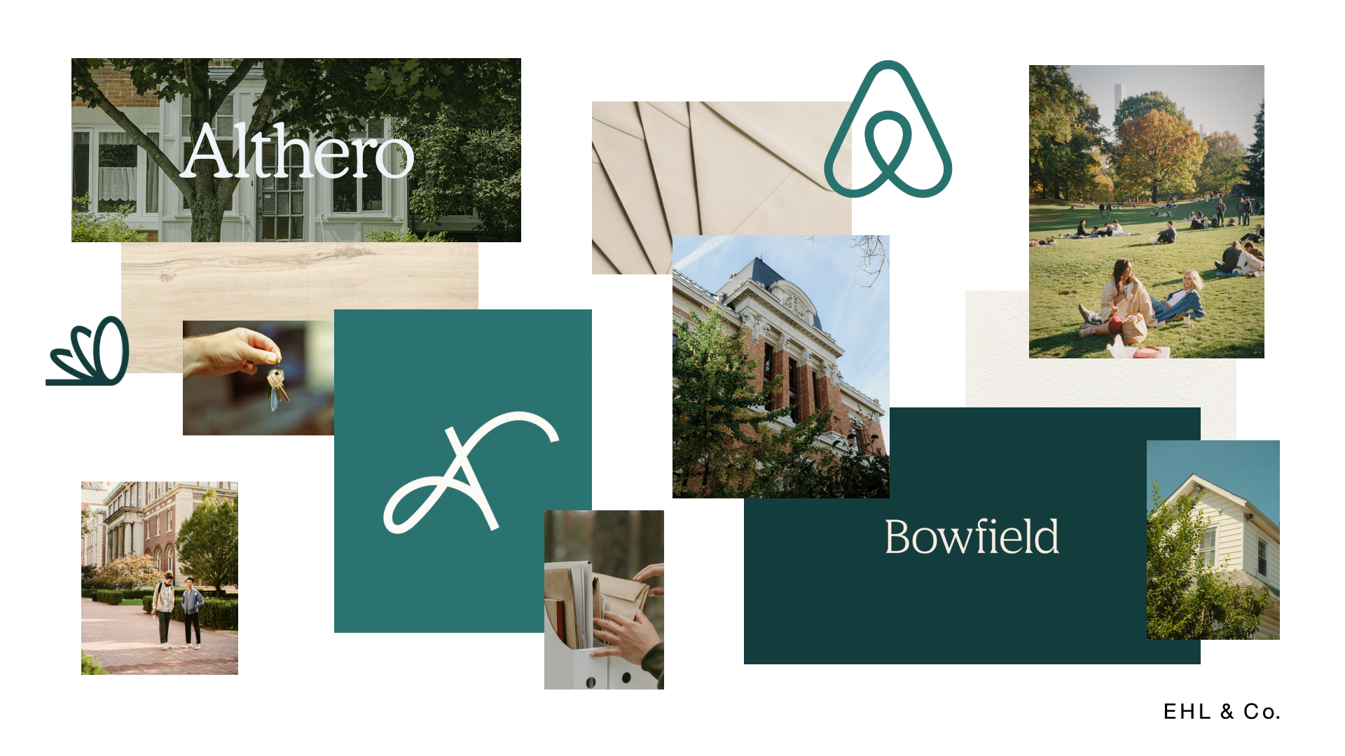
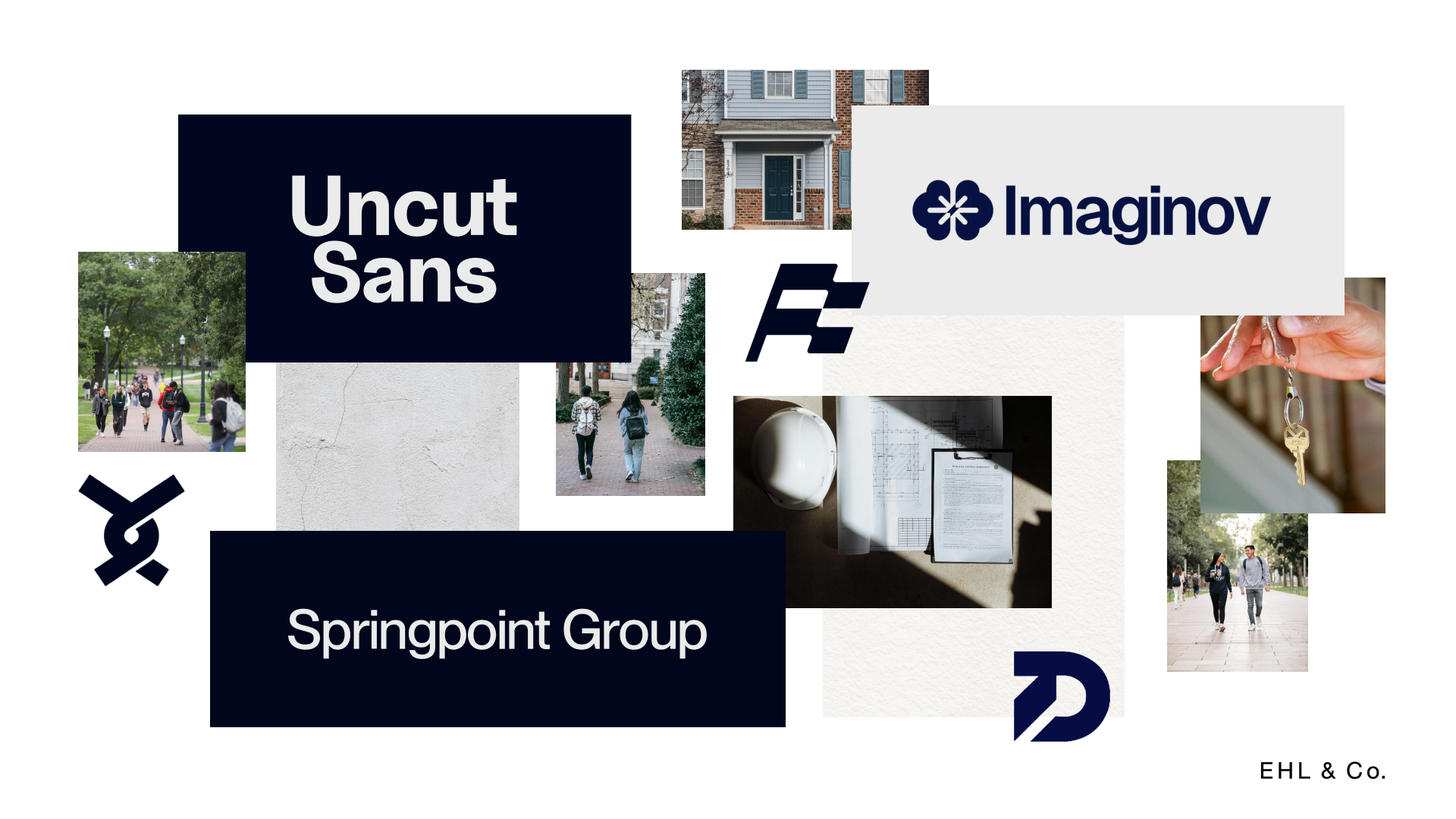
The design style draws from both established real estate firms and modern, youth-driven brands. I looked at hotel brand systems for direction on how to create subbrands that are distinct in their positioning while still cohesive within the broader ecosystem.

The Solution
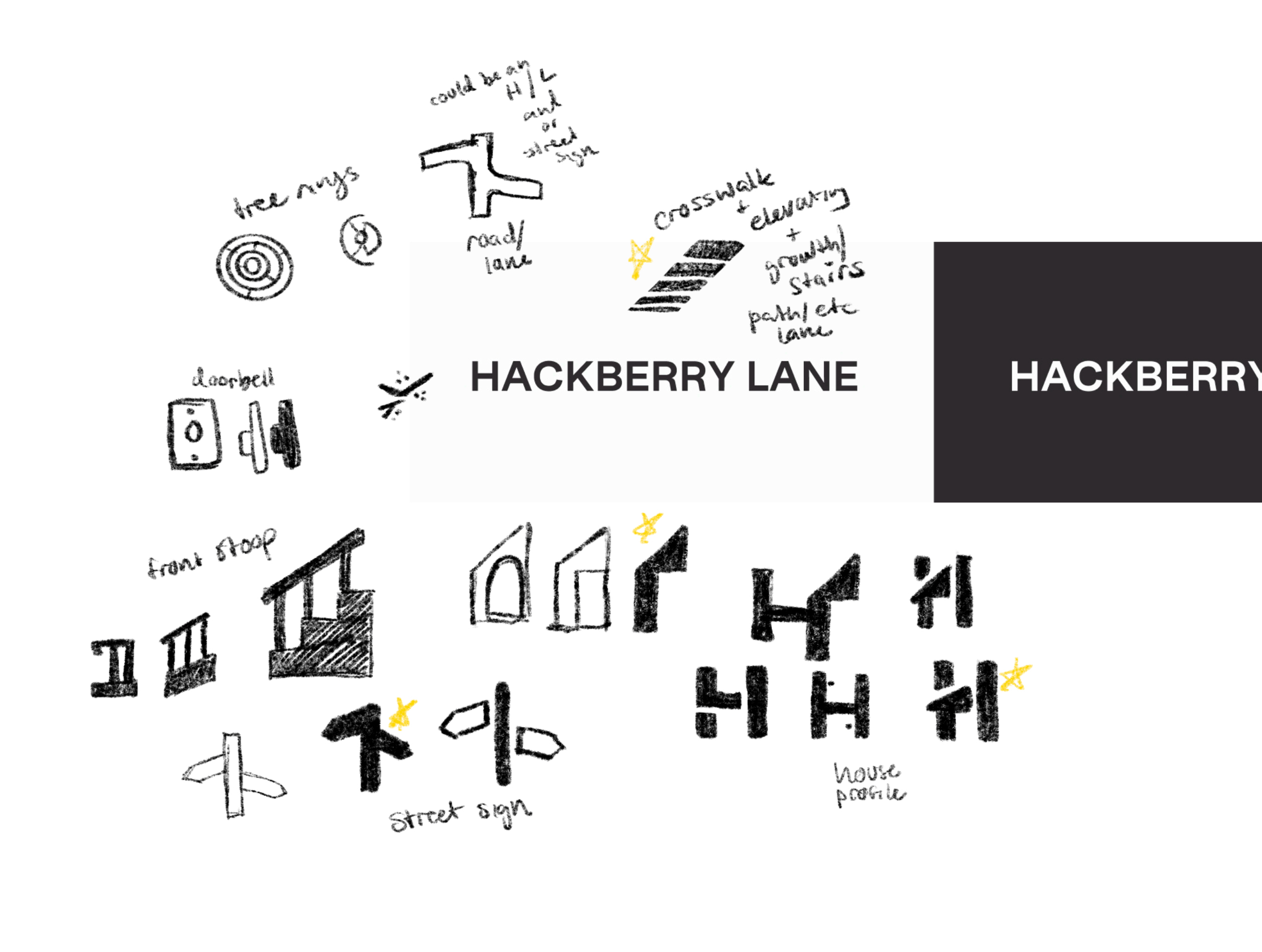
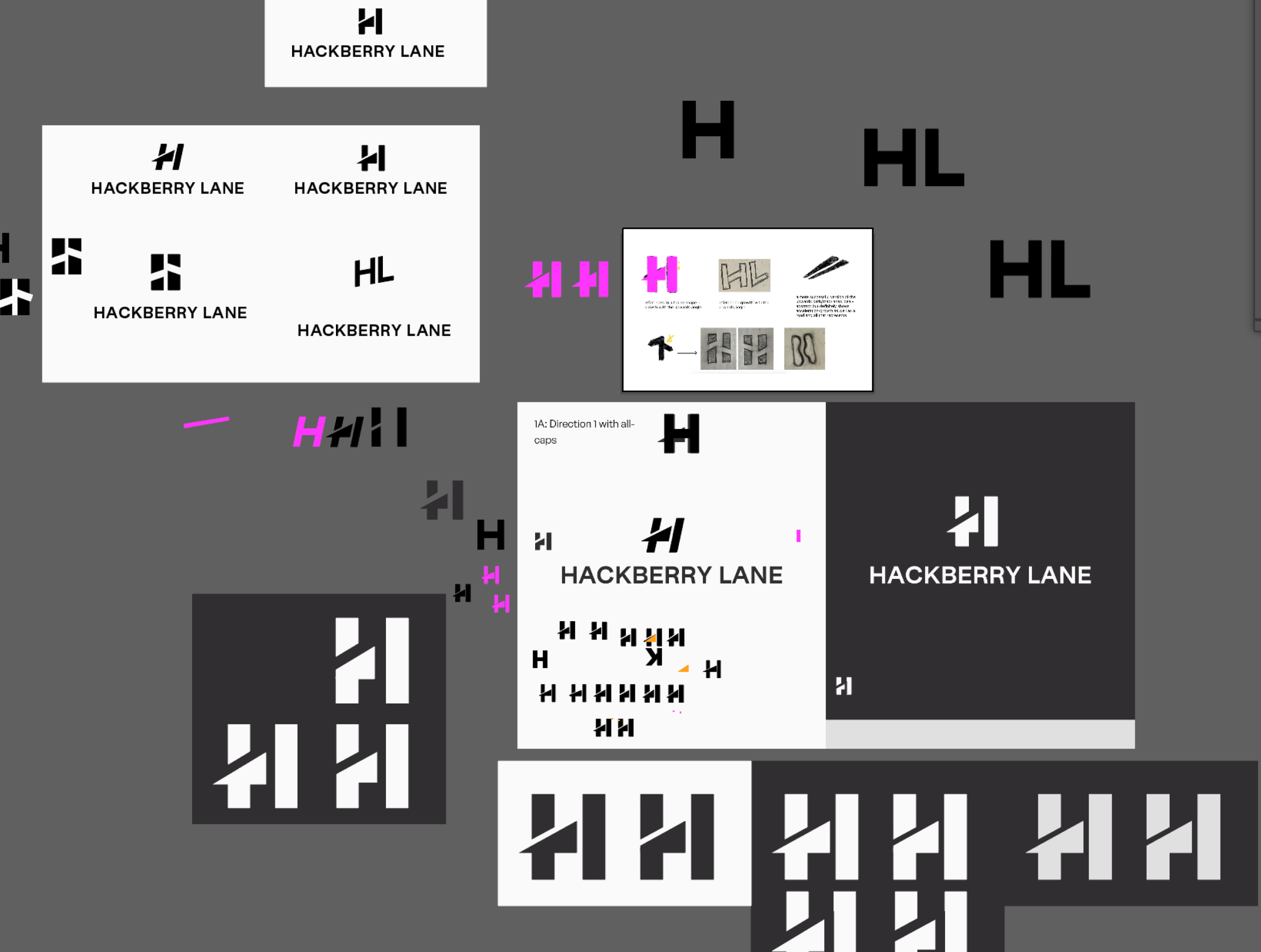
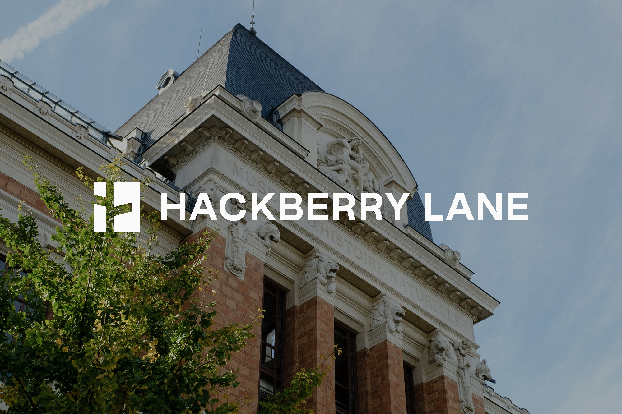
The Hackberry Lane symbol features a street sign embedded within the negative space of a rectangle, a reference to the brand’s origin on Hackberry Lane at the University of Alabama. The symbol also looks like an H, which ties back to the brand name.
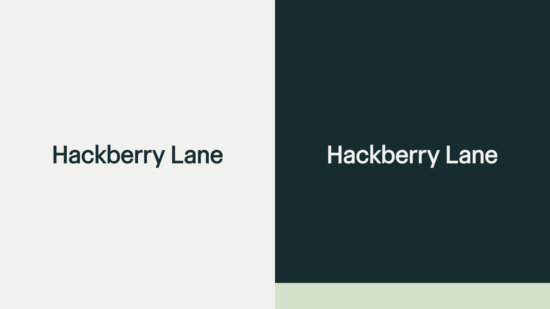
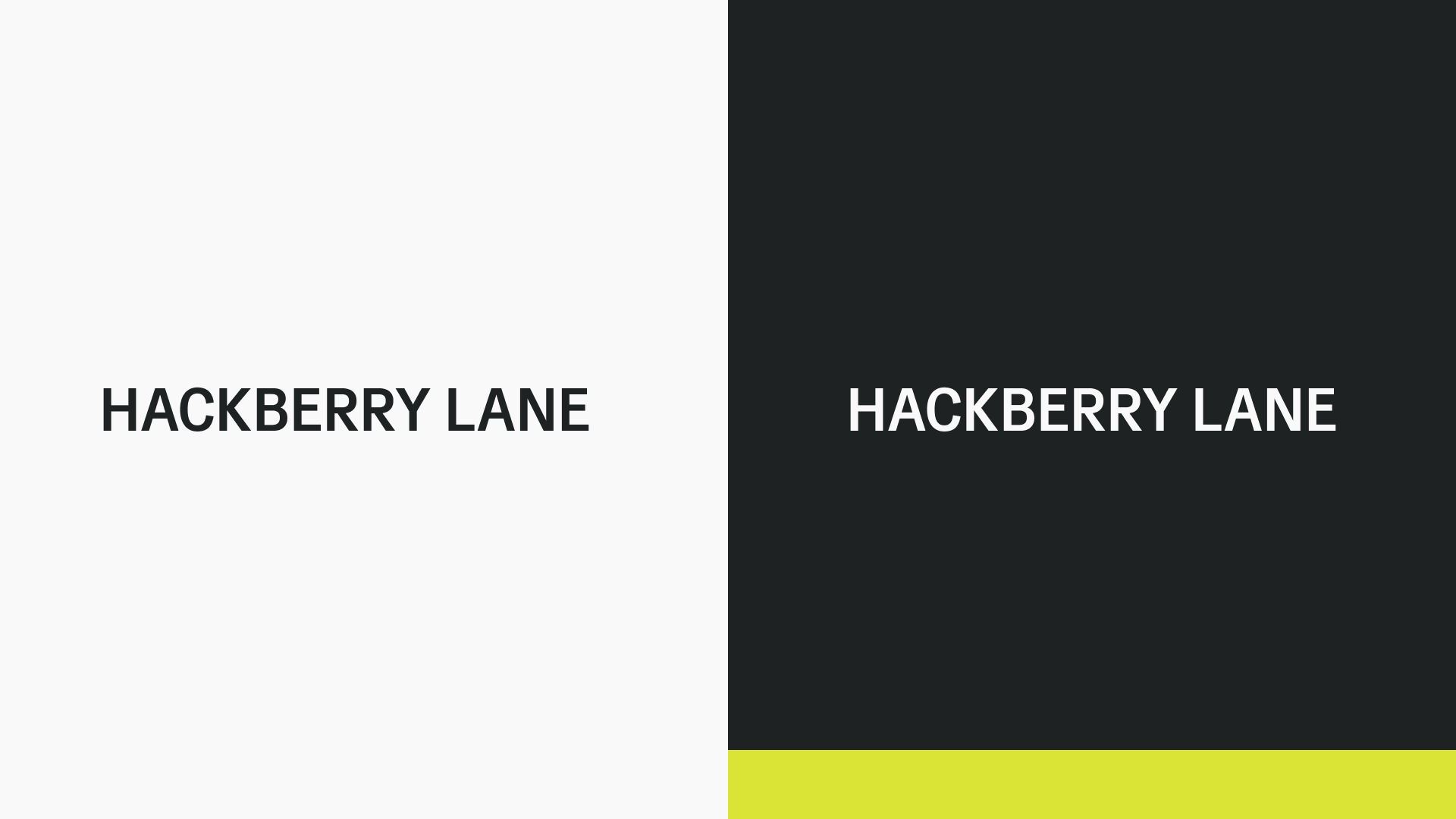
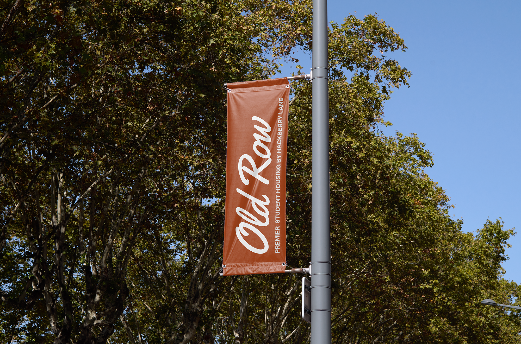
Haven’s logo portrays the subbrand’s contemporary, luxury living options with a calming purple palette and a clean, modern doorway symbol. Old Row leans more into a legacy-driven, collegiate aesthetic, with a rust red tone, a more textured font, and a classic Southern character that evokes heritage and tradition.


Process