How do you capture the community-focused approach in the branding of an architectural design firm?
Studio IRHA
The Problem
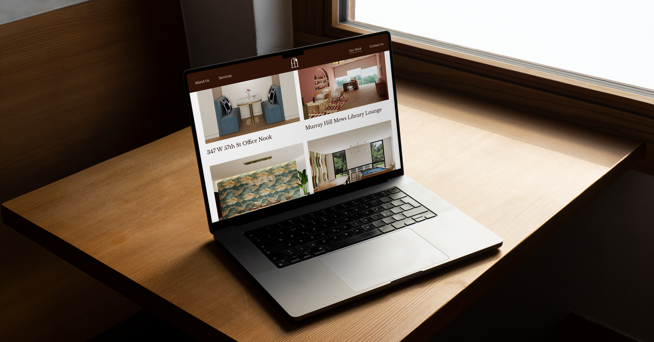
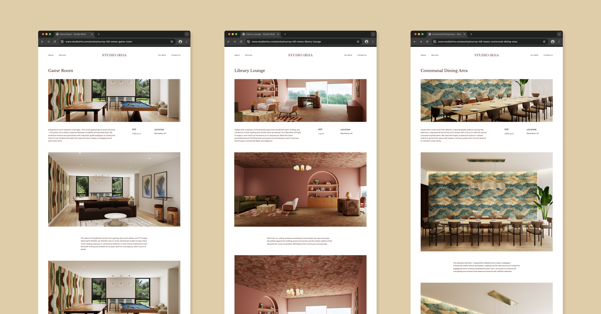
Studio IRHA redefines how amenity spaces create genuine value for the people who use them and the owners who invest in them. How do you design a brand that feels community-driven and approachable without losing its sense of professionalism?

The Insight
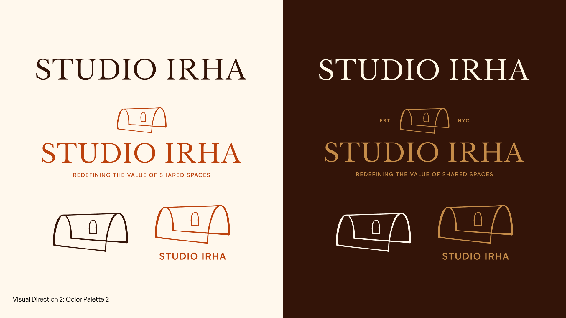
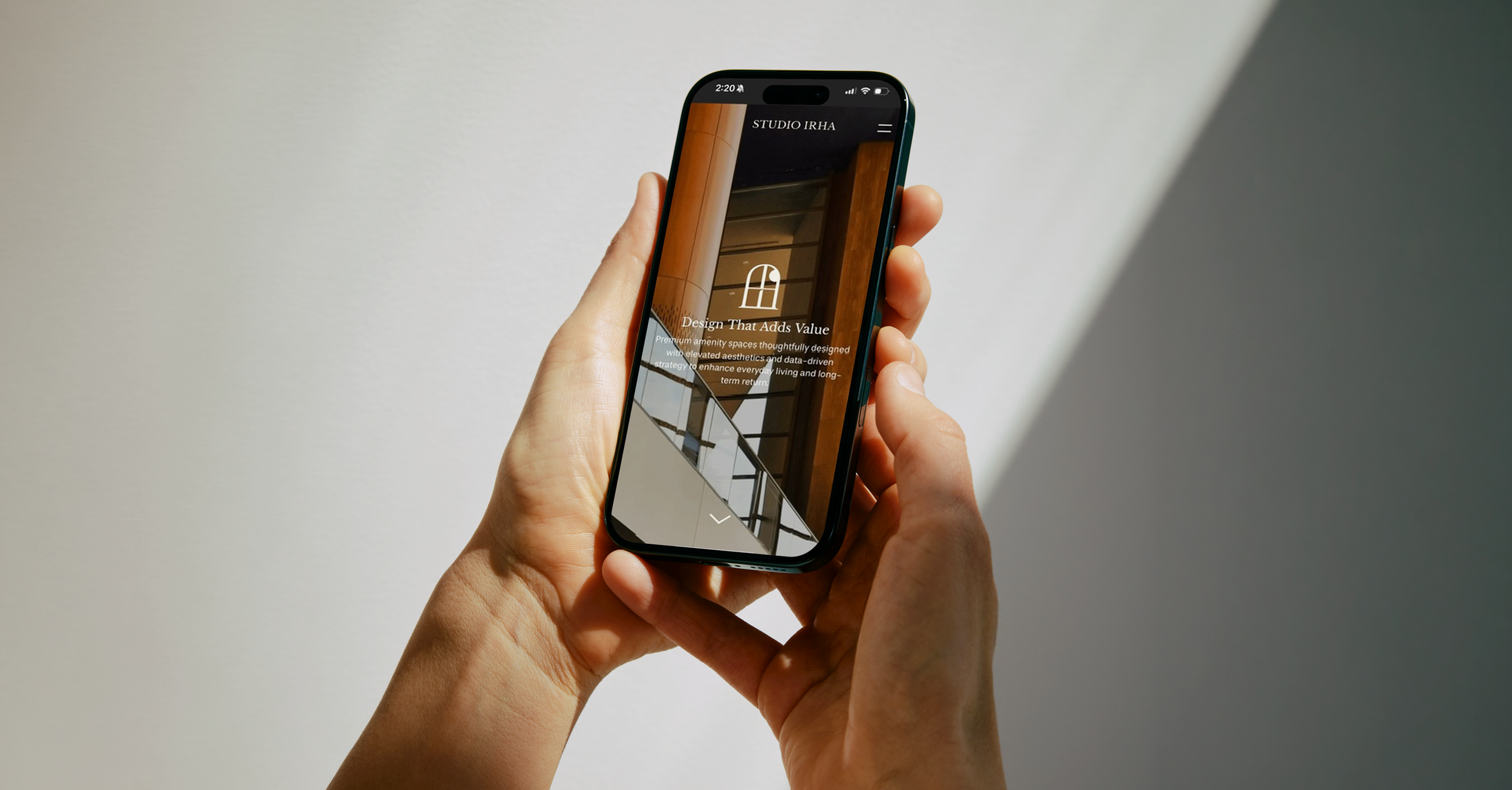
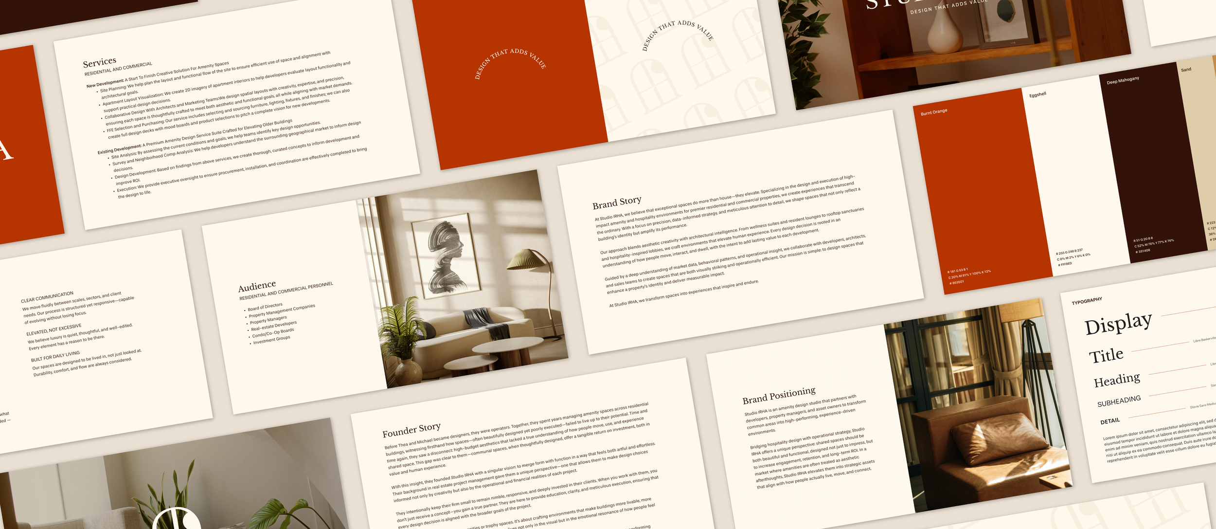
When brainstorming a symbol to represent Studio IRHA, we selected a window, as it is a literal representation of interior design and architecture, and a metaphorical representation of Studio IRHA shedding light on the true value of an amenity space. Windows are a common feature in all the spaces Studio IRHA works on: lobbies, hallways, common rooms, gyms, and more.
The Solution
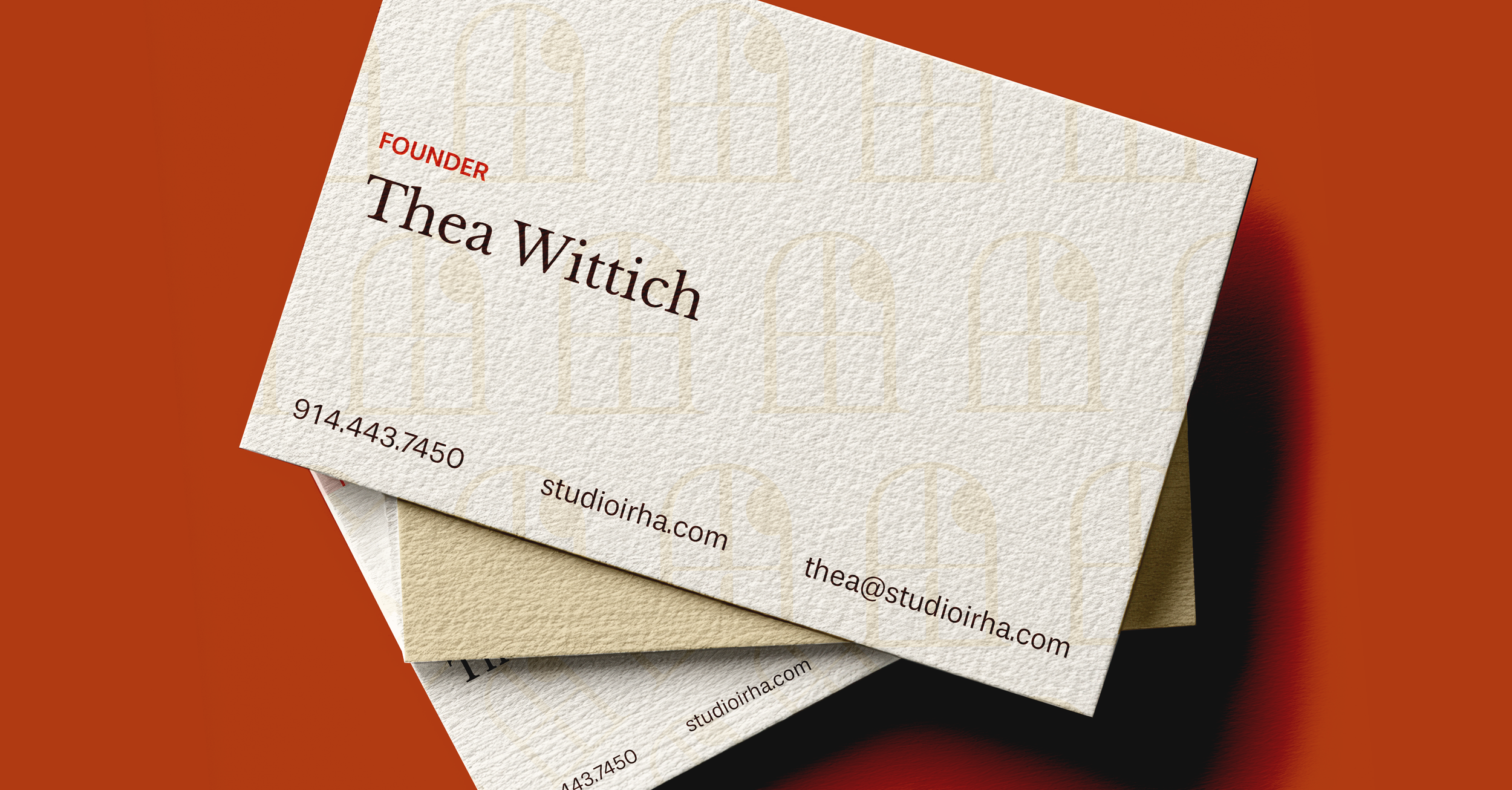
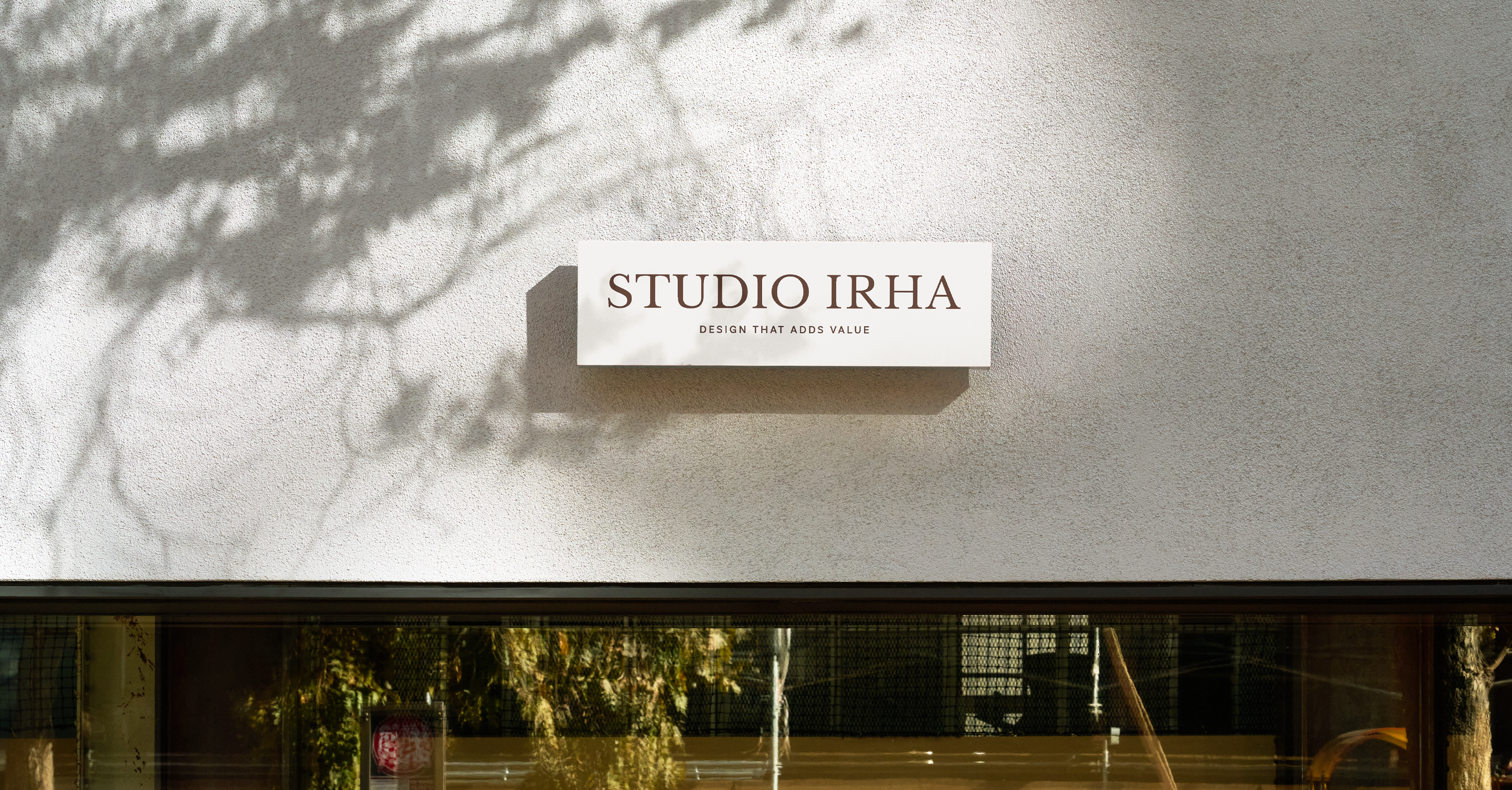
To reflect Studio IRHA’s balance of approachability and authority, we built a warm color palette centered on a deep orange, a hue rarely seen in other architectural design brands. We selected a serif typeface to give the brand a grounded, serious presence, and the symbol mirrors the font’s line weights and curves to create a cohesive logo suite.
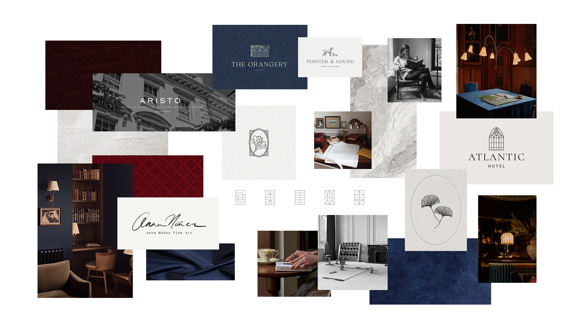
Process