
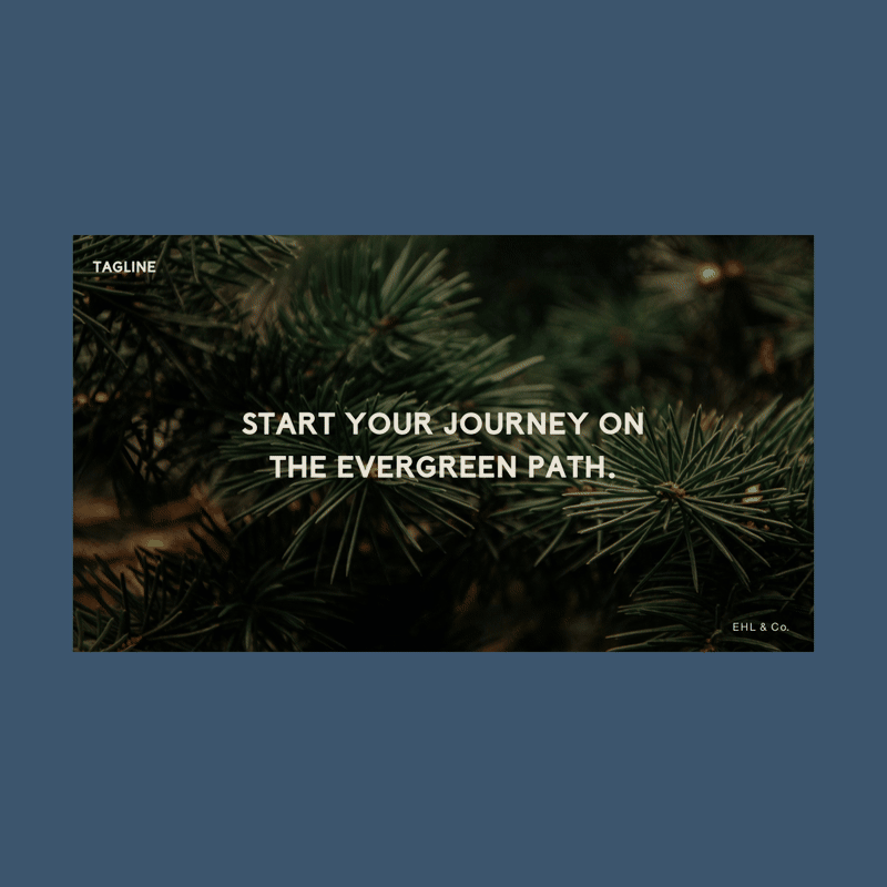
The Evergreen Path
A brand identity & social media presence for life coach, Rob Greenberg.
The Problem
On the surface, Rob Greenberg is a friendly but tough-looking guy with a New York accent. However, he’s also a public company officer turned entrepreneur, father of three sons, and a Stage 4 lung cancer survivor. The embodiment of strength and resilience, he is now pursuing a career as a life coach. How do you craft a brand identity and social media presence that reflects his life journey and stays true to his authentic, gritty, and caring nature?
The Insight
A life coach offers a unique service, as they are essentially selling their personality and credibility. This made it crucial for the logo to authentically feel like Rob. Throughout the brand identity development process, I continually referred back to Rob’s key brand pillars of approachability, empowerment, professionalism, compassion, and wisdom to ensure that anyone encountering his brand would immediately understand his distinct vibe.
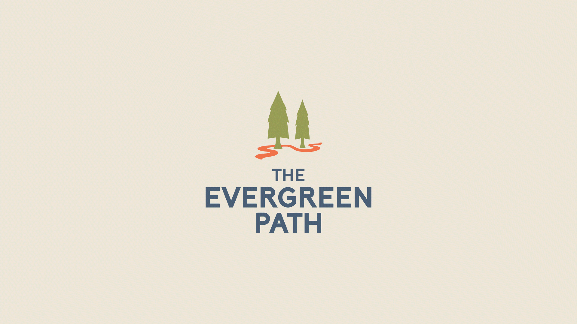
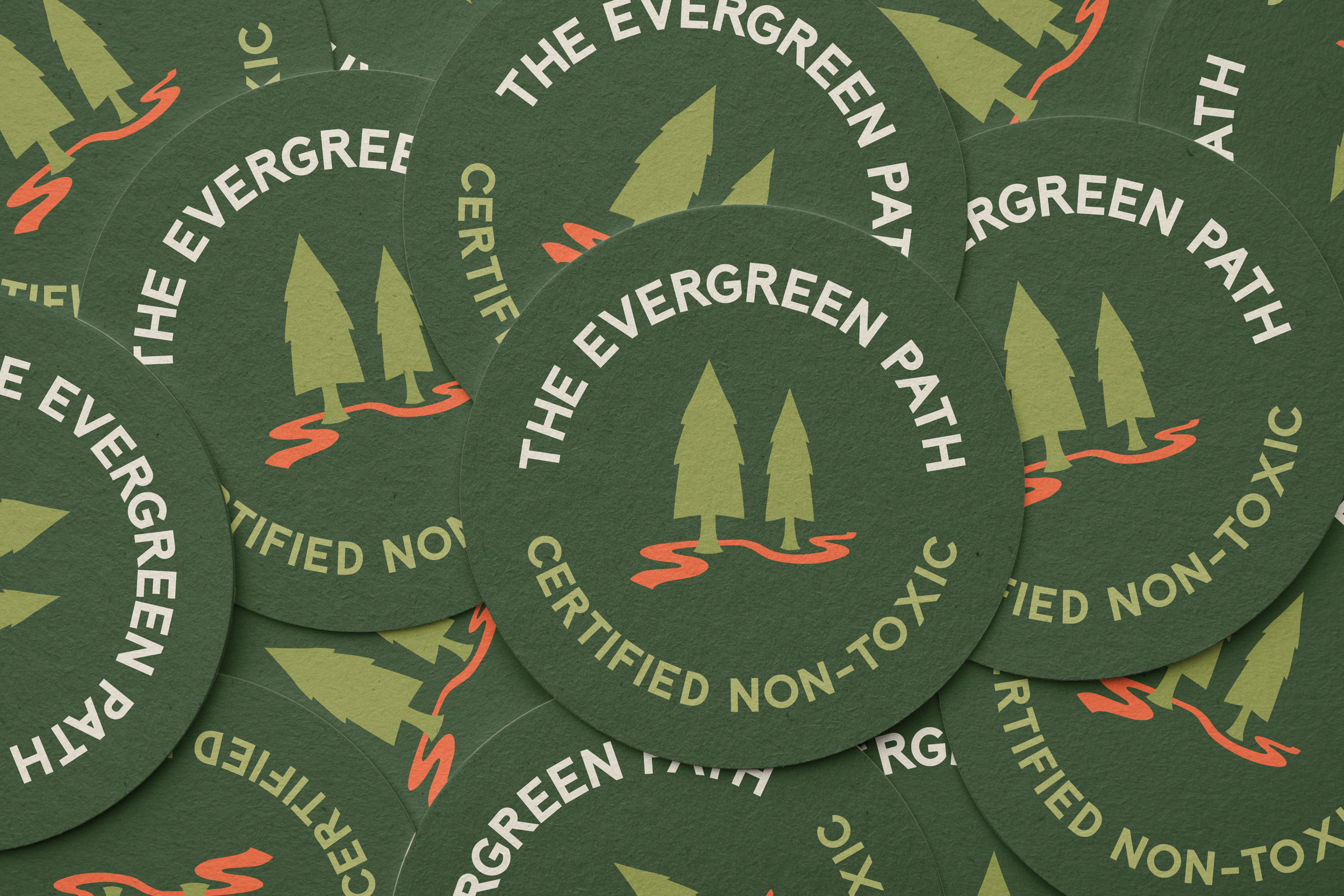
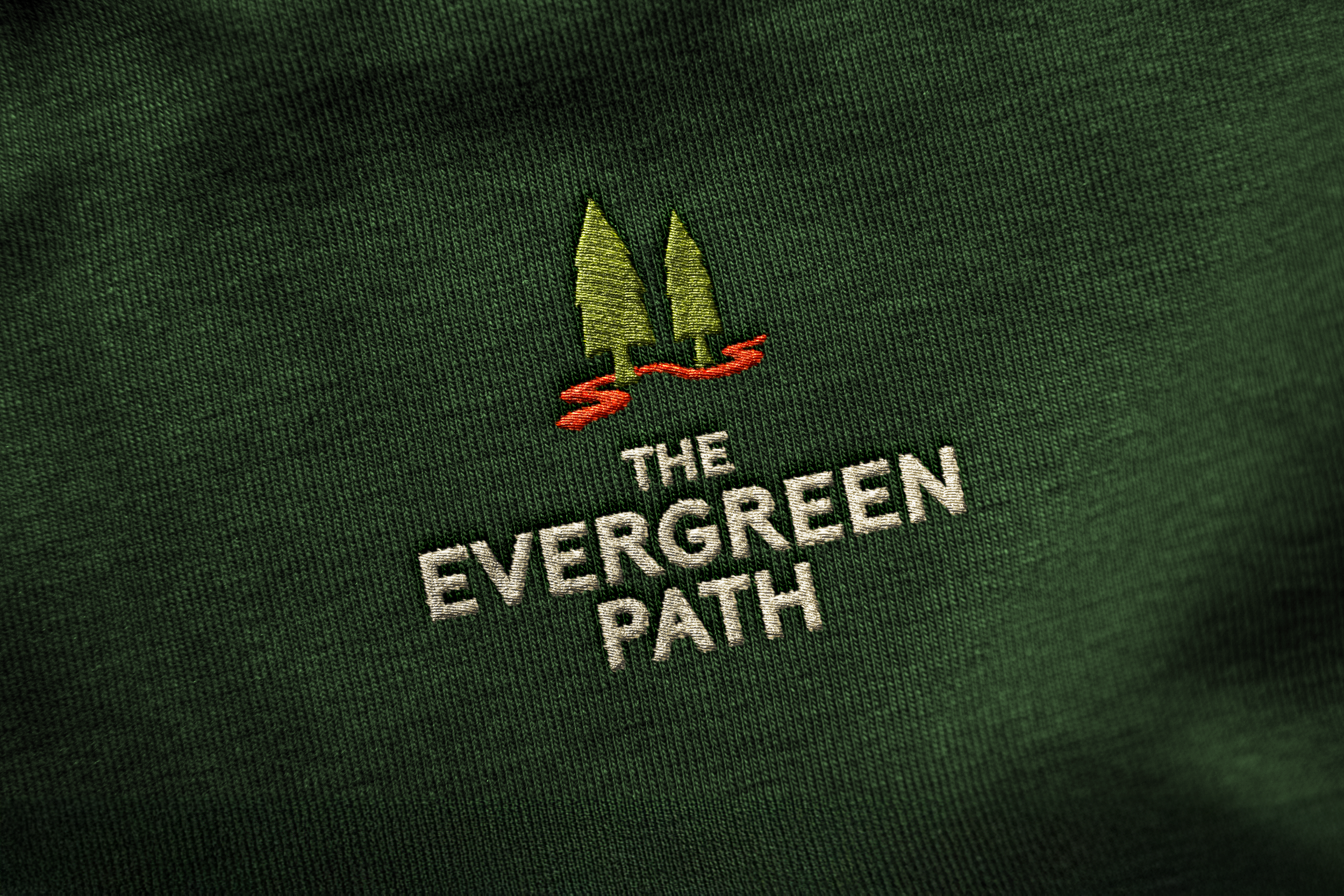
The Brand Identity
The logo features two trees, symbolizing a life coach and his client, each drawn in a rounded, cartoon-like style to convey approachability and warmth, almost as though the two trees could lean in and support one another. Highlighted in bright orange, a path twists around the trees at a slight incline, representing the client’s journey. Paired with a bold, sans serif font, the final mark balances masculinity and approachability, which perfectly captures Rob’s personality.


Social Media

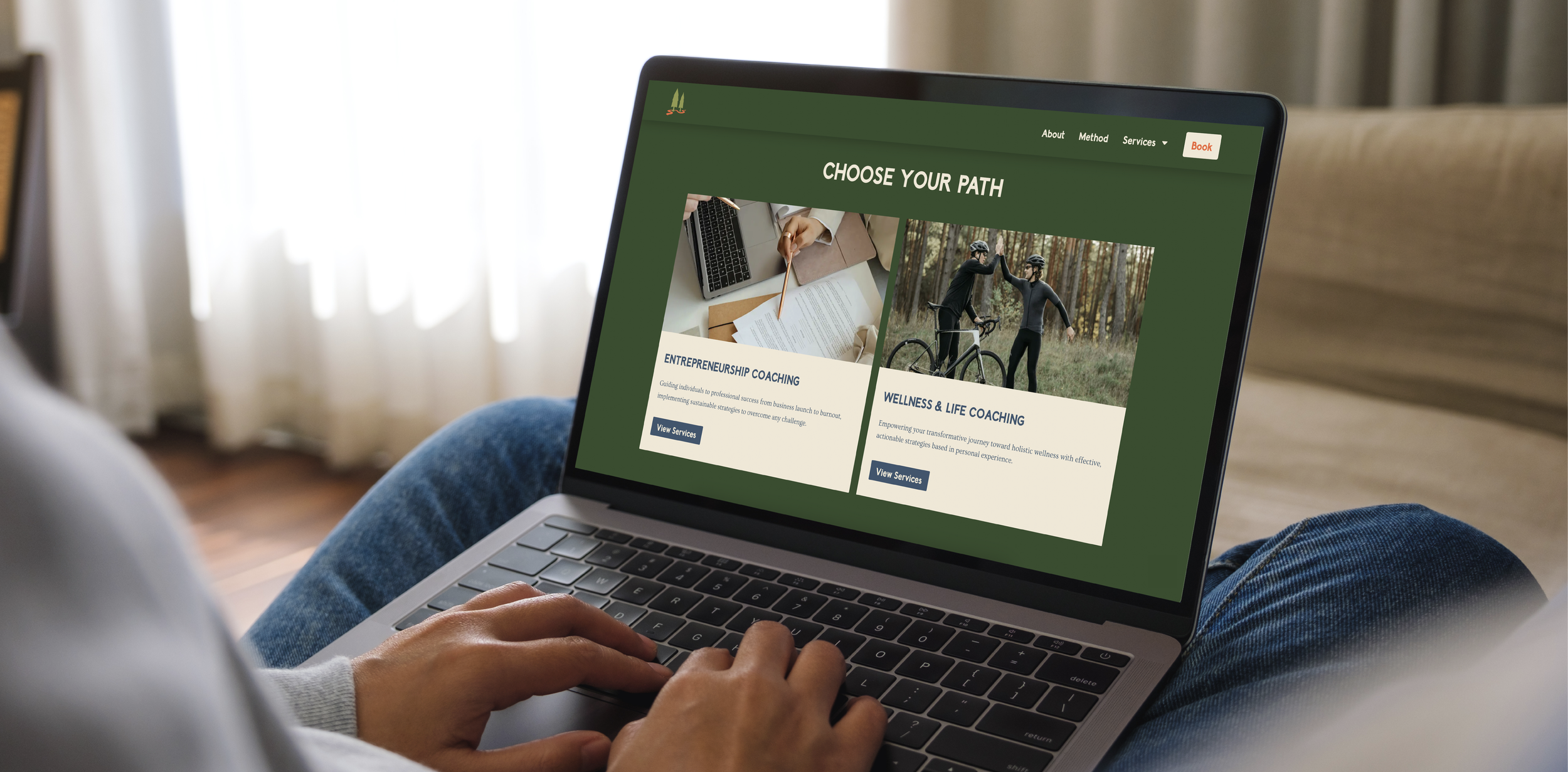
The Content
After completing Rob’s branding & identity, we launched his social presence from scratch. As creative director, I led strategy, content concepts, visual style, and monthly shoots, directing Rob to give strong performances while ensuring his comfort and confidence. In six months, we grew his account to 350 followers, with monthly stats of over 10,000 views, 2,000 accounts reached, 800 interactions, and 300 profile visits.
For Rob’s “Morning Routine” video, I organized a variety of dynamic shots to showcase his commitment to health & wellness, drawing inspiration from successful “day in the life” content from competitor accounts to align with proven engagement trends.
This concept was inspired by another account we manage, where the video features the client walking with overlaid text. This low-effort format became one of the account’s most successful videos with nearly 900 views.
I developed the concept of Rob ranking current wellness trends from 1 to 10, using a quick, engaging format that capitalizes on the attention-grabbing style of top-performing social media content.
This video was inspired by the viral “Sign Guy” account on Instagram, taking cues from his visually striking and verbally intriguing format designed to immediately capture attention and leave a lasting impression.
Process


