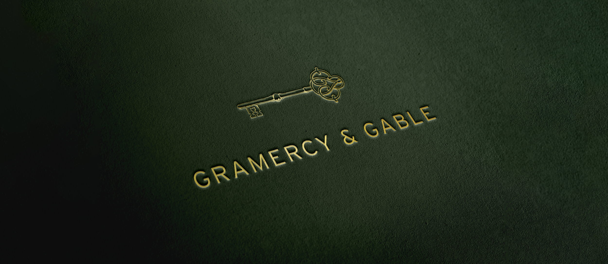
Gramercy & Gable
How do you design a brand that embodies the timeless prestige, exclusivity, and elegance of old New York?
The Problem
With over four decades of combined experience in luxury property management, these founders set out to build a brand that evokes the sophistication and quiet luxury of old-money New York. With a firm named after the iconic gates of Gramercy Park, how do you design a logo that feels less like a new business and more like a longstanding New York institution?
The Insight
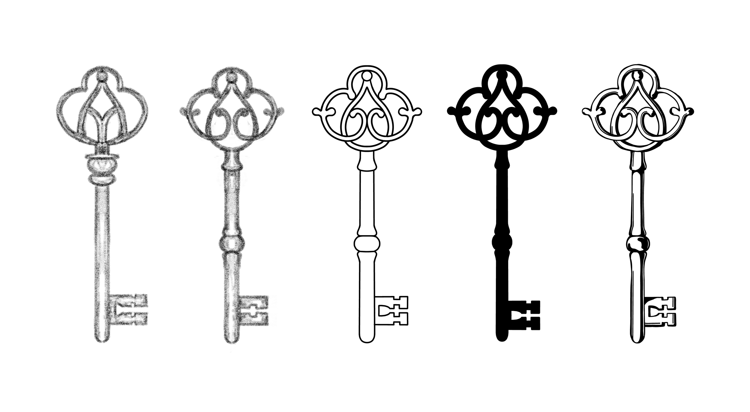
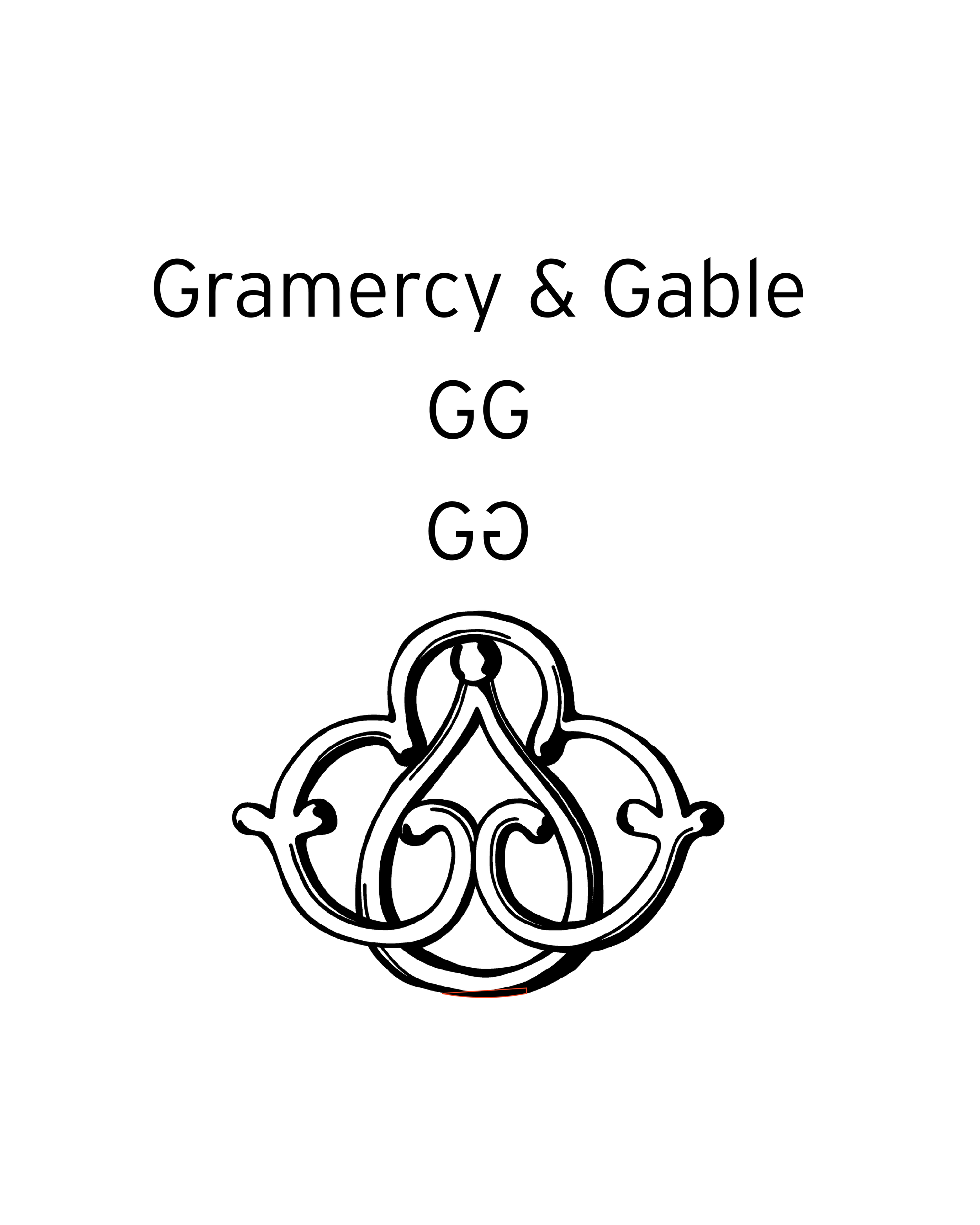
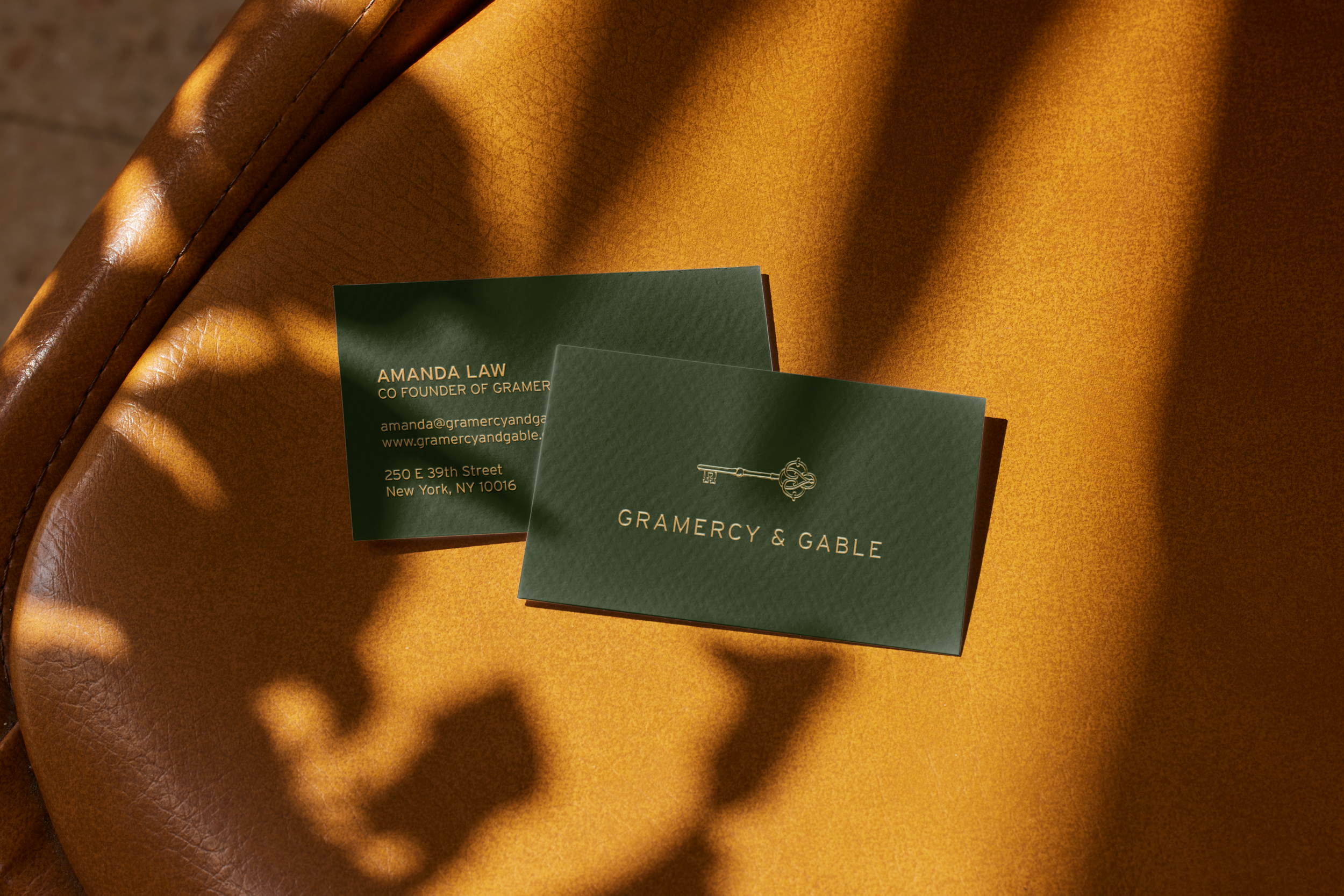
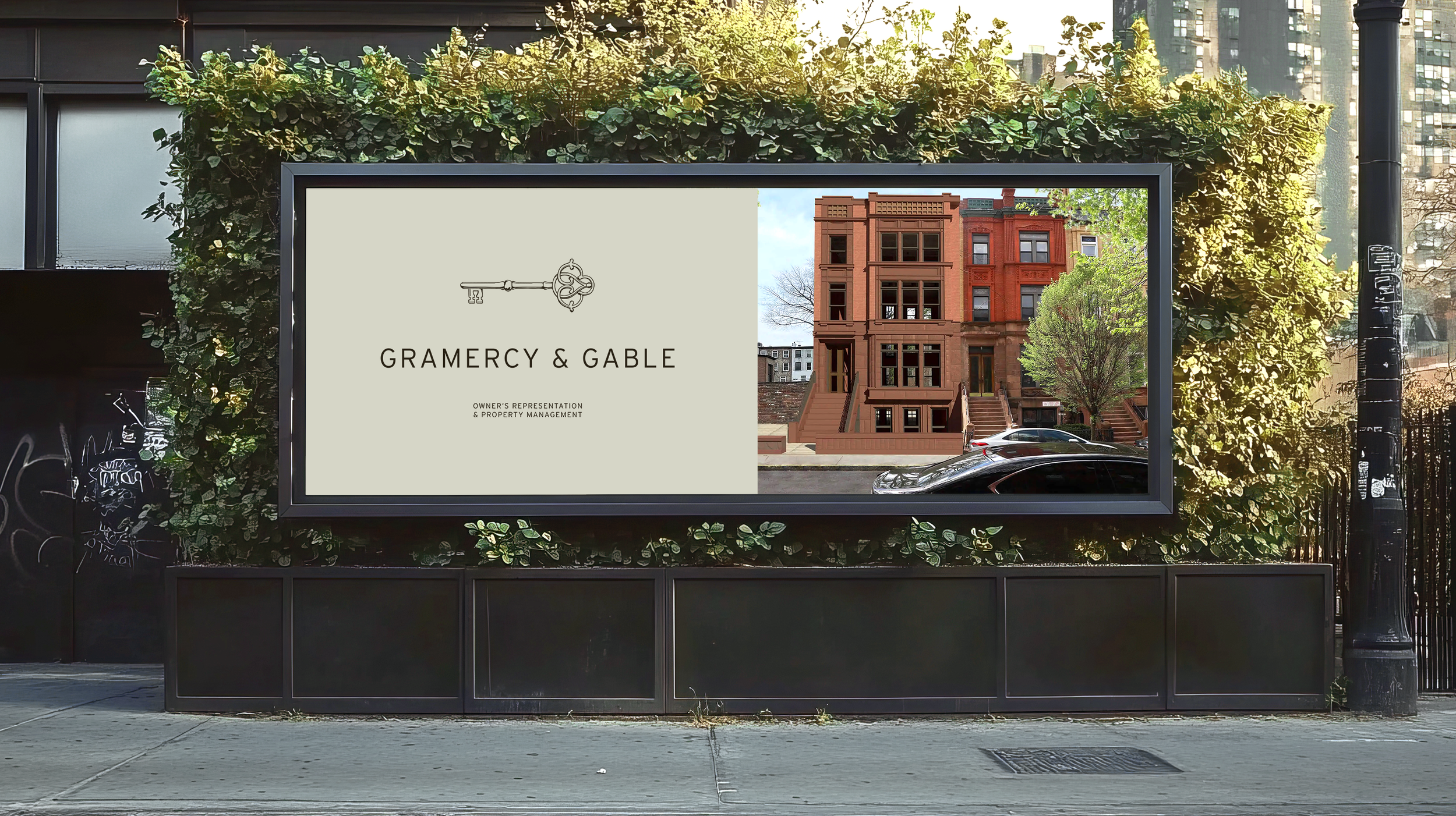
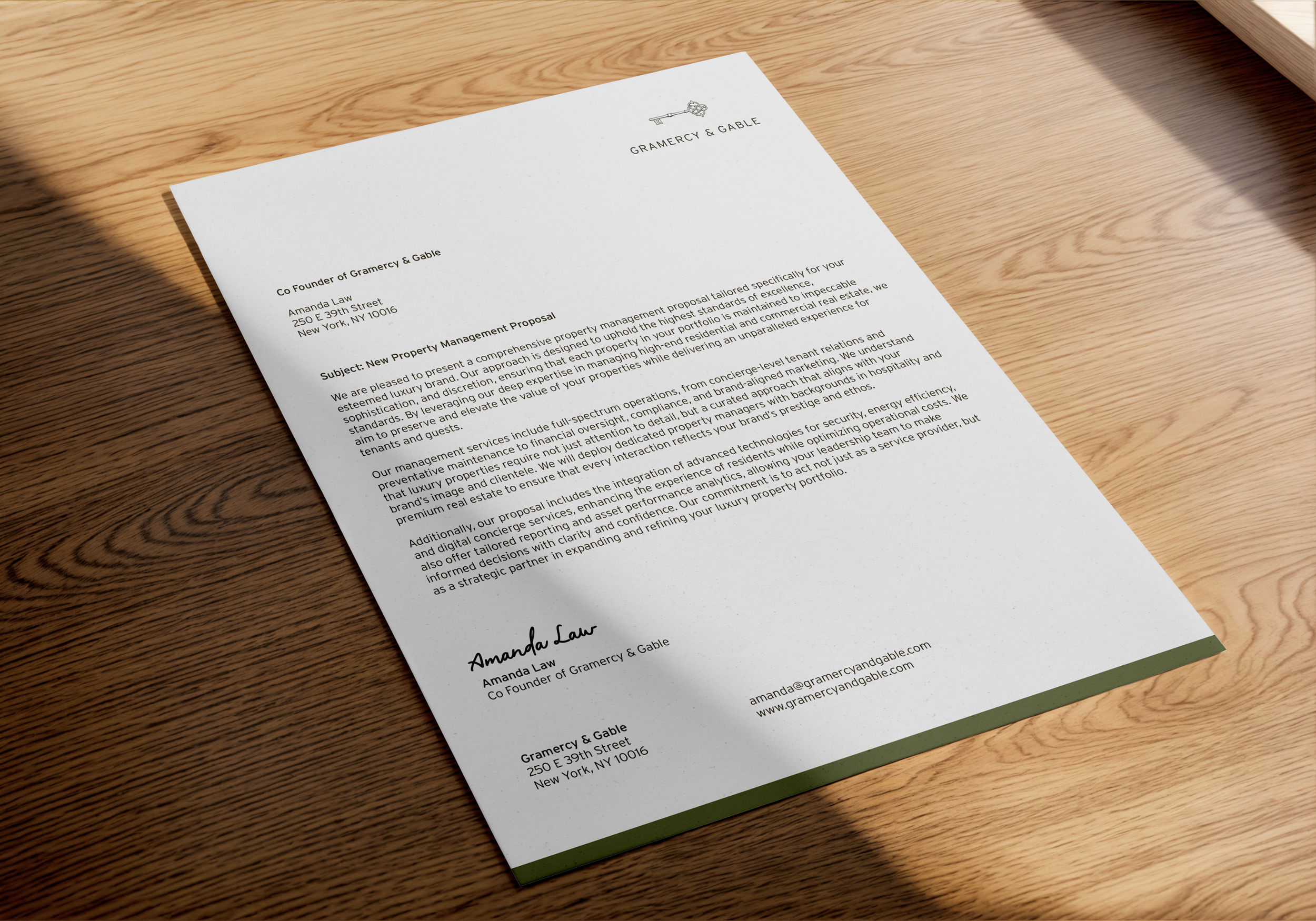
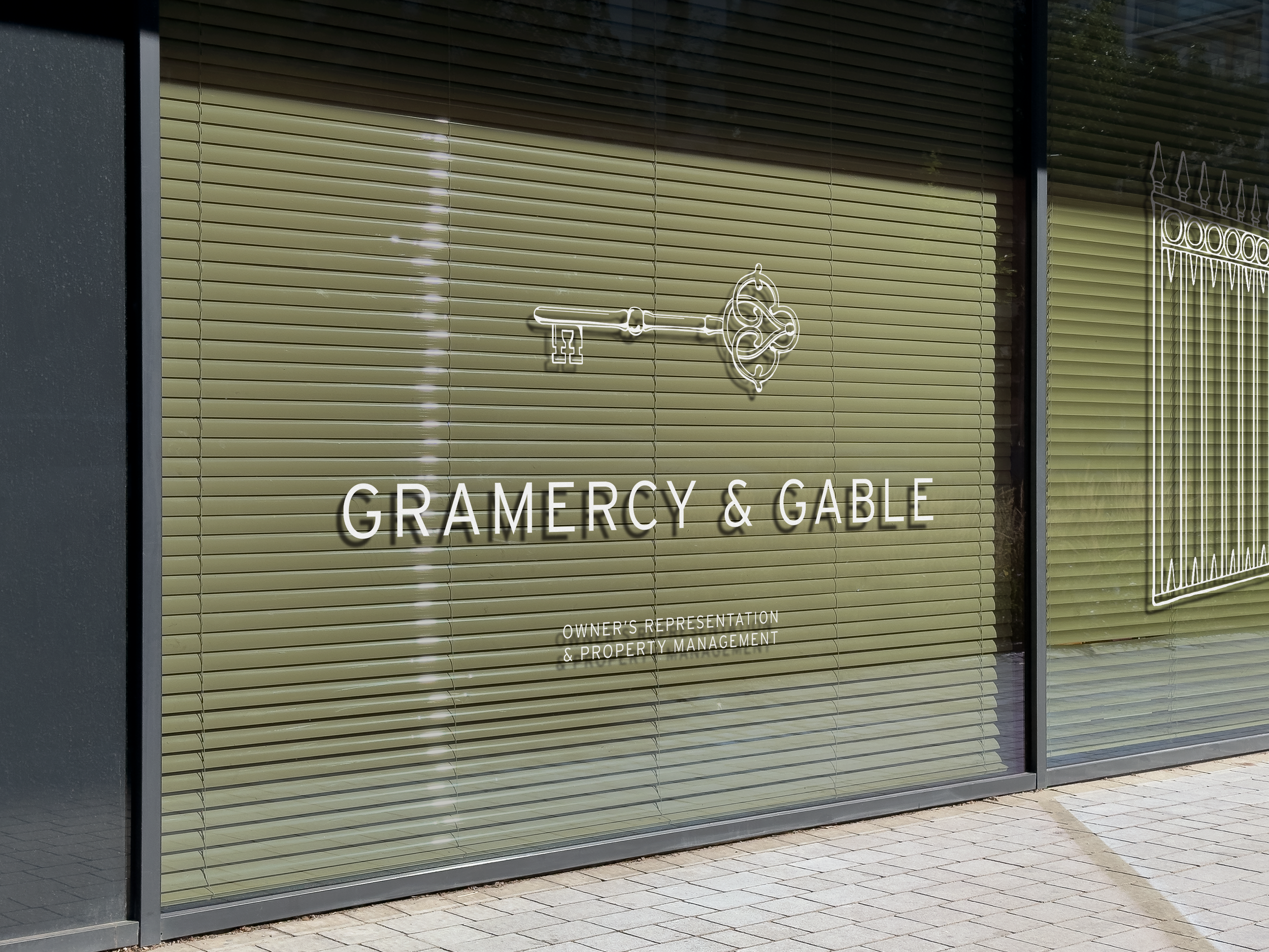
With a name like Gramercy & Gable, the logo needed to subtly evoke the iconic key to Gramercy Park. I designed a custom key symbol by drawing inspiration from the ornate wrought iron gates surrounding the park, integrating aerial architectural motifs, and shaping the key’s head from two mirrored “G”s, creating a mark that feels both historic and bespoke.
The Solution
The logo came to life once I redrew the key in a clean, hand-crafted style that felt both classic and modern. All the little details added along the way, like the fine lines that create shadow and depth, give the symbol personality and richness. Paired with a simple sans serif font, the full logo feels timeless and leaves just enough mystery to make you wonder: what does the key unlock?


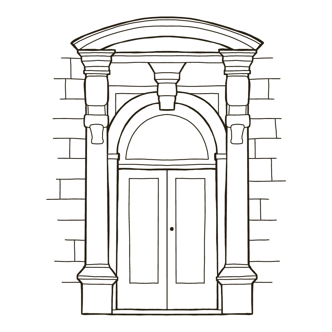
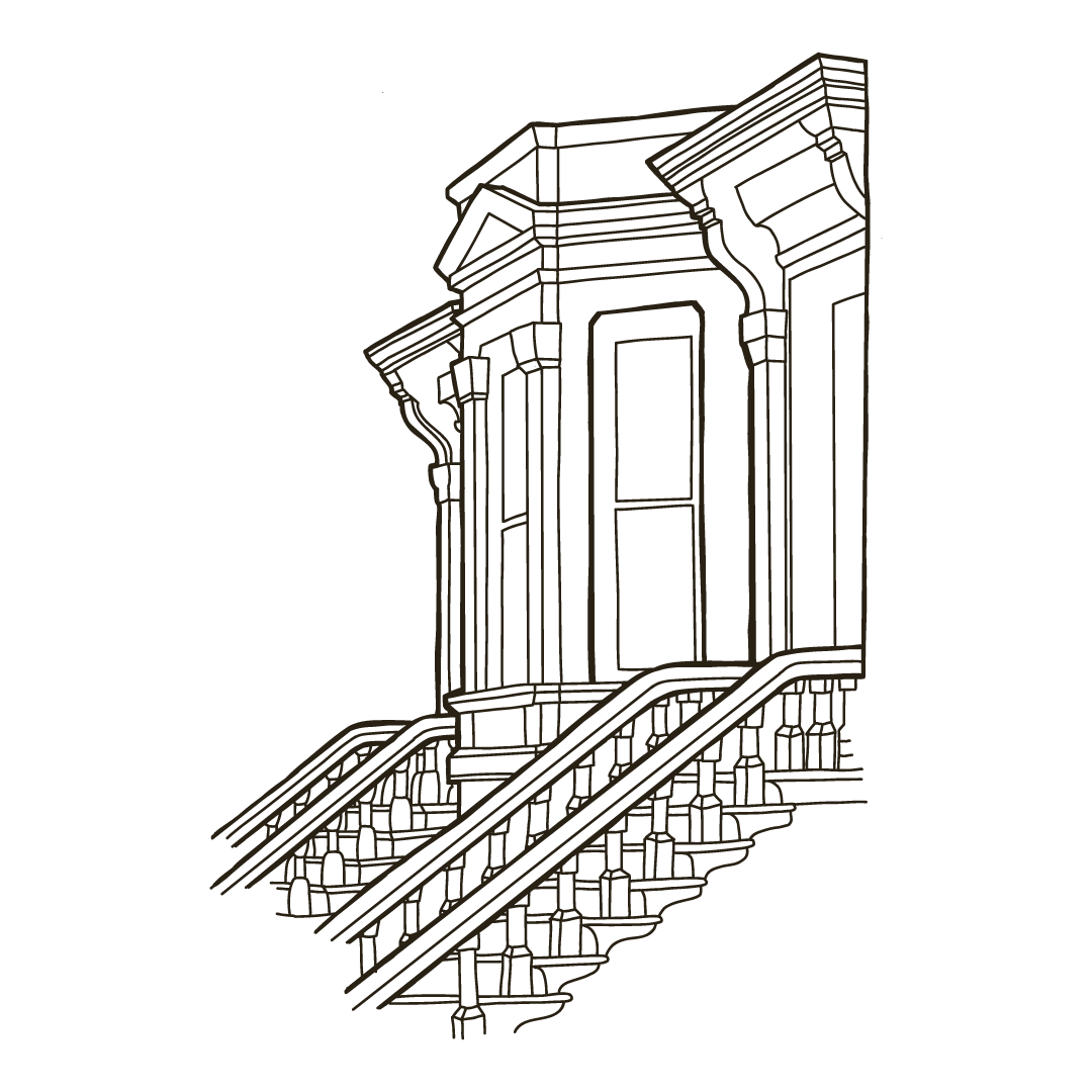

Process